Rosemary
Rosemary
Rosemary
A Lifestyle Plant E-Commerce Website
August 2022 - December 2022
A Lifestyle Plant E-Commerce Website
August 2022 - December 2022
A Lifestyle Plant E-Commerce Website
August 2022 - December 2022

2nd Redesign of High Fidelity - Updated July 2023***
2nd Redesign of High Fidelity - Updated July 2023***
2nd Redesign of High Fidelity - Updated July 2023***
I revisited Nice Score! with new knowledge and best practices I learned during my certificate program and after. The last mockup still felt congested in the design. I learned about auto-layout and designed with the mockup with this design in mind. I gained a better understanding on how to use and create components. I re-evaluated the overall user experience of Nice Score! and revamp pages to engage with user with adding organizational features and better visual design.
I revisited Nice Score! with new knowledge and best practices I learned during my certificate program and after. The last mockup still felt congested in the design. I learned about auto-layout and designed with the mockup with this design in mind. I gained a better understanding on how to use and create components. I re-evaluated the overall user experience of Nice Score! and revamp pages to engage with user with adding organizational features and better visual design.
I revisited Nice Score! with new knowledge and best practices I learned during my certificate program and after. The last mockup still felt congested in the design. I learned about auto-layout and designed with the mockup with this design in mind. I gained a better understanding on how to use and create components. I re-evaluated the overall user experience of Nice Score! and revamp pages to engage with user with adding organizational features and better visual design.
Project Overview
Project Overview
Project Overview
Nice Score! is an arcade high score tracking mobile application. The arcade community does not have a centralized application to post scores. This application with will allow users to post on the go without any paywalls.
As the Lead UX Designer and Lead UX Researcher, my role involves managing various aspects of the user experience design process. I am responsible for conducting thorough user research, gathering insights, and translating them into user stories that drive the design process. With a focus on user-centric design, I created wireframes and prototypes that effectively communicate design concepts and iterate upon them based on feedback. I also conduct usability studies to ensure that the final product meets user needs and expectations. Ultimately, my role is to deliver a seamless and enjoyable user experience that meets business goals and exceeds user expectations.
The Design Process
The Design Process
The Design Process


Understanding the User
Understanding the User
Understanding the User
As the UX designer of a high score mobile application, I embarked on an extensive research journey to understand the users and their needs. Through a combination of in-depth interviews and empathy maps, I identified a primary user group - avid arcade goers - who are seeking easier access to high arcade scores in their area.
While the primary purpose of the application was clear, my research uncovered additional user pain points. I discovered that there is currently no unified platform for arcade goers to share and discuss their scores, leading to fragmented information and experiences. Additionally, users expressed frustration with the difficulty in finding arcades, navigating within them, and even knowing which games are available.
By thoroughly understanding the needs and pain points of the users, I am able to design a high score mobile application that not only meets their core needs but also delivers a seamless and enjoyable user experience.
Pain Points
Pain Points
Pain Points

Lack of
Central Platform
Lack of
Central Platform
There is no centralized platform for arcade enthusiasts to share and engage in discussions about their high scores.
There is no centralized platform for arcade enthusiasts to share and engage in discussions about their high scores.
There is no centralized platform for arcade enthusiasts to share and engage in discussions about their high scores.

Using different applications for simple actions
Using different applications for simple actions
Managing messaging, score posting, and arcade location across multiple applications can be quite cumbersome.
Managing messaging, score posting, and arcade location across multiple applications can be quite cumbersome.
Managing messaging, score posting, and arcade location across multiple applications can be quite cumbersome.

Chelsea
42 Years Old
Persona
“Sunday afternoons at the arcade with my family are my saving grace from the chaotic work week. I love sharing my childhood experience with my son”
Problem Statement
Chelsea, a dedicated working mother and wife who frequently travels, yearns to share her high scores with her family even while being away, as it serves as a means of maintaining a strong connection with her loved ones.
Goals
Wants to bond with her family when she is away for work.
Would like to share high scores found around the country with her son.
Would like to easily locate arcades that have similar games to her home arcade.
Frustrations
"It makes me sad when I am away on travel and I can't truly bond with my family over our shared love for arcade games.
“I wish there was a way to find arcades that have similar games to my home arcade. Currently, I have to look on their website or social media to get an idea of what games they have.”
“It would be awesome to share high scores from the different arcades I visit with my son. It's kind of annoying to send so many pictures to him."

Can’t view high scores around the world
Can’t view high scores around the world
At the arcade, it's customary for gamers to come across high scores specific to that particular venue, which often prompts the question: 'What is the all-time highest score in the world?
At the arcade, it's customary for gamers to come across high scores specific to that particular venue, which often prompts the question: 'What is the all-time highest score in the world?
At the arcade, it's customary for gamers to come across high scores specific to that particular venue, which often prompts the question: 'What is the all-time highest score in the world?
Persona
Persona
Chelsea
42 Years Old
Problem Statement
Chelsea, a dedicated working mother and wife who frequently travels, yearns to share her high scores with her family even while being away, as it serves as a means of maintaining a strong connection with her loved ones.
Goals
Wants to bond with her family when she is away for work.
Would like to share high scores found around the country with her son.
Would like to easily locate arcades that have similar games to her home arcade.
Frustrations
"It makes me sad when I am away on travel and I can't truly bond with my family over our shared love for arcade games.
“I wish there was a way to find arcades that have similar games to my home arcade. Currently, I have to look on their website or social media to get an idea of what games they have.”
“It would be awesome to share high scores from the different arcades I visit with my son. It's kind of annoying to send so many pictures to him."
“Sunday afternoons at the arcade with my family are my saving grace from the chaotic work week. I love sharing my childhood experience with my son”
Chelsea's User Journey
Chelsea's User Journey
Goal:
Goal:
An easier and more exciting way to share her high score with her son when she is away.
An easier and more exciting way to share her high score with her son when she is away.
SHARE HIGH SCORE WITH SON

TASK LIST
Pull out phone to take picture of her score
Message son with picture of her high score
EMOTIONS
Accomplished
Ecstatic
Caring
IMPROVEMENT OPPORTUNITIES
App to submit scores and alerts son of score
Reaction button and chat function
STRATEGIZE GAME PLAY

TASK LIST
Walk around to get layout of arcade and find favorite games to play
Set time and budget to play
Play games
EMOTIONS
Calculative
Determined
Excited
IMPROVEMENT OPPORTUNITIES
Map of arcade
Immediate access to see high score for games at the arcade
GO TO ARCADE

TASK LIST
Get into the car and use google maps
Pick route fastest to get to arcade
Arrive at destinations
EMOTIONS
Anxious
Focused
Defensive
IMPROVEMENT OPPORTUNITIES
Offer ridesharing on app
FIND ARCADE

TASK LIST
Google Search “Arcade Nearby”
Pick one close by to hotel
Use google maps
EMOTIONS
Curious
Anxious
Bittersweet
IMPROVEMENT OPPORTUNITIES
Better searching methods for finding arcades in app
List of games each arcade provide prior to arrival

FIND ARCADE
TASK LIST
Google Search “Arcade Nearby”
Pick one close by to hotel
Use google maps
EMOTIONS
Curious
Anxious
Bittersweet
IMPROVEMENT OPPORTUNITIES
Better searching methods for finding arcades in app
List of games each arcade provide prior to arrival
GO TO ARCADE
TASK LIST
Get into the car and use google maps
Pick route fastest to get to arcade
Arrive at destinations
EMOTIONS
Anxious
Focused
Defensive
IMPROVEMENT OPPORTUNITIES
Offer ridesharing on app
STRATEGIZE GAME PLAY
TASK LIST
Walk around to get layout of arcade and find favorite games to play
Set time and budget to play
Play games
EMOTIONS
Calculative
Determined
Excited
IMPROVEMENT OPPORTUNITIES
Map of arcade
Immediate access to see high score for games at the arcade
SHARE HIGH SCORE WITH SON
TASK LIST
Pull out phone to take picture of her score
Message son with picture of her high score
EMOTIONS
Accomplished
Ecstatic
Caring
IMPROVEMENT OPPORTUNITIES
App to submit scores and alerts son of score
Reaction button and chat function
Starting the Design
Starting the Design
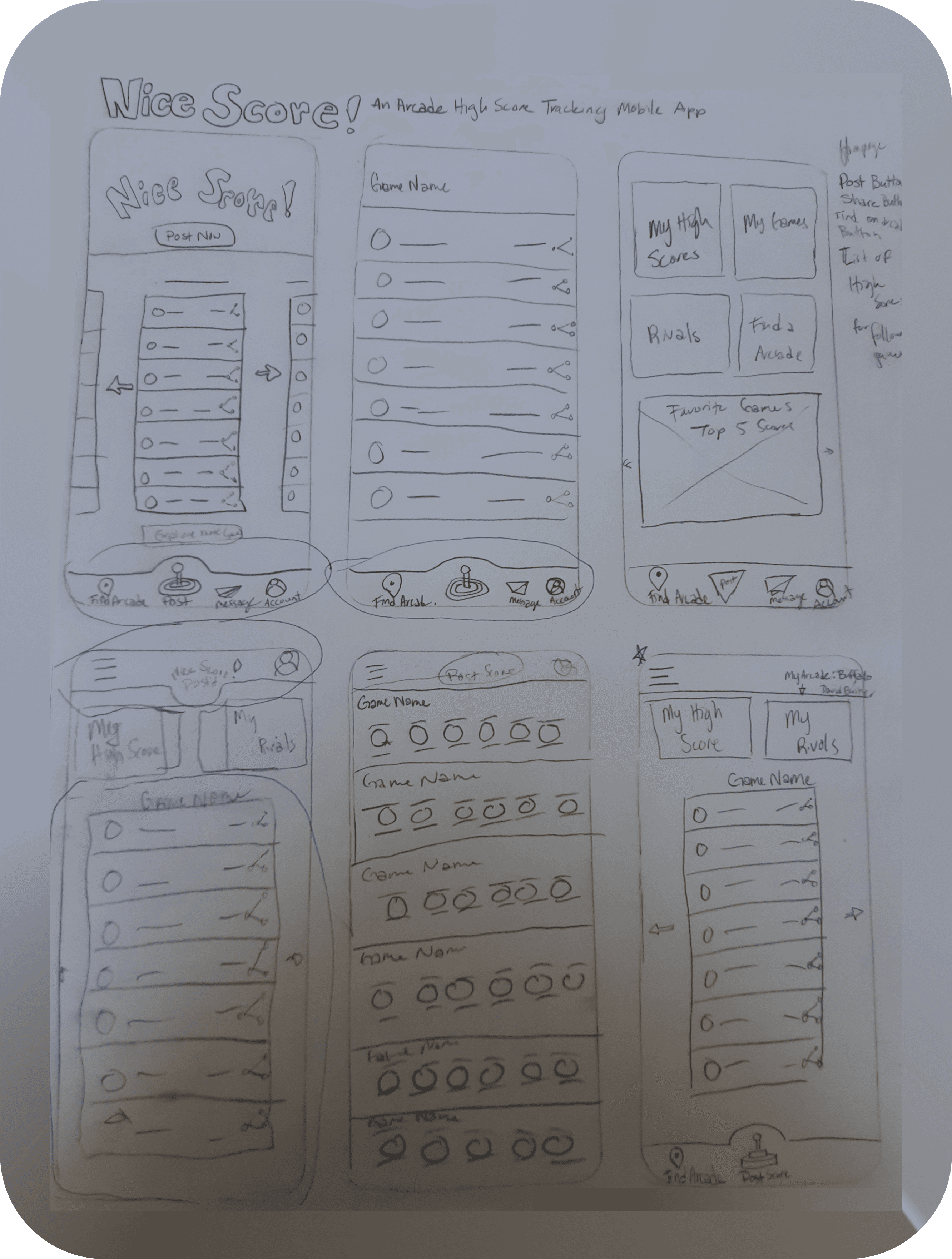
Paper Wireframes
Paper Wireframes
Throughout each iteration of the paper wireframes, my goal was to address the user's pain points effectively. I ensured that the 'post high score' button stood out prominently. The design also placed emphasis on displaying and sharing high scores for favorited games. Moreover, I aimed to add a personalized touch to the home screen, allowing users to conveniently access their scores and rival lists. Simplicity was key in the design, ensuring that users wouldn't feel overwhelmed when using the application. The circled items on each sketch will be incorporated into the initial digital wireframe.
Throughout each iteration of the paper wireframes, my goal was to address the user's pain points effectively. I ensured that the 'post high score' button stood out prominently. The design also placed emphasis on displaying and sharing high scores for favorited games. Moreover, I aimed to add a personalized touch to the home screen, allowing users to conveniently access their scores and rival lists. Simplicity was key in the design, ensuring that users wouldn't feel overwhelmed when using the application. The circled items on each sketch will be incorporated into the initial digital wireframe.
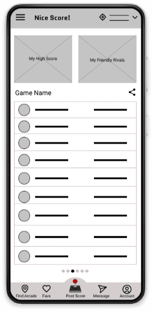
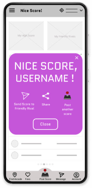
Digital Wireframes
Digital Wireframes
Presented below are the initial iterations of the digital wireframe. The design boasts user-friendly navigation, with clearly labeled sections for easy exploration. Users can effortlessly post their scores from any point within the application, thanks to the fixed bottom navigation bar.
Presented below are the initial iterations of the digital wireframe. The design boasts user-friendly navigation, with clearly labeled sections for easy exploration. Users can effortlessly post their scores from any point within the application, thanks to the fixed bottom navigation bar.

Usability Study
Usability Study
I conducted a usability study on the initial wireframes to gain insights into user interactions with my application and identify areas for improvement before proceeding with the creation of a mid-fidelity mockups. The research questions I aimed to answer were as follows
I conducted a usability study on the initial wireframes to gain insights into user interactions with my application and identify areas for improvement before proceeding with the creation of a mid-fidelity mockups. The research questions I aimed to answer were as follows
How long does it take for a user to post a high score?
Can users successfully post their scores?
Can users successfully share their scores with friendly rivals?
Is it clear in the design how to post a high score?
Which parts of the application's design are unnecessary?
How long does it take for a user to post a high score?
Can users successfully post their scores?
Can users successfully share their scores with friendly rivals?
Is it clear in the design how to post a high score?
Which parts of the application's design are unnecessary?
To measure the success of addressing these questions, I utilized key performance indicators such as time on task, conversion rates, drop-off rates, and the system usability scale. This unmoderated usability study involved providing participants with a link to a Google Form containing tasks to complete and a usability scale. During the task section, participants were instructed to record their interactions with the application and share their thoughts out loud.
To measure the success of addressing these questions, I utilized key performance indicators such as time on task, conversion rates, drop-off rates, and the system usability scale. This unmoderated usability study involved providing participants with a link to a Google Form containing tasks to complete and a usability scale. During the task section, participants were instructed to record their interactions with the application and share their thoughts out loud.
Round 1 Findings
Round 1 Findings
As a result of the usability study, below are the following insights I gained:
Enhancing the visibility of pagination is crucial.
Users express the desire for a method to authenticate their scores.
It is necessary to reconsider the design of navigation buttons and pages.
Revised Low Fidelity Wireframe
Revised Low Fidelity Wireframe
Based on the findings, I revisited the wireframe and incorporated adjustments to address the feedback received. Presented below is the second iteration of Nice Score! Here's a summary of the changes made:
Based on the findings, I revisited the wireframe and incorporated adjustments to address the feedback received. Presented below is the second iteration of Nice Score! Here's a summary of the changes made:
Pagination: The pagination feature has been redesigned to offer a gesture-based experience, accompanied by a visual indicator that informs users about horizontal scrolling for accessing additional content.
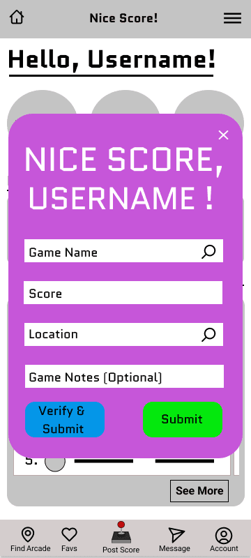
Verification Button: To cater to user preferences, I introduced a verification button within the high score submission overlay. This feature enables users to utilize their device cameras to scan and authenticate their high scores while at the arcade.
Location Locator: After considering participant feedback, I decided to remove the location locator feature from the top right. This decision was made as it caused confusion among users, served as a redundant feature, and wasn't essential for the initial release of the application. In its place, I incorporated a hamburger menu that grants users access to their high scores, explore section, and friendly rivals when not on the home page.
Home Button: Addressing a missing element in the initial wireframe, I added a home button for improved navigation and ease of returning to the home page.
Pagination: The pagination feature has been redesigned to offer a gesture-based experience, accompanied by a visual indicator that informs users about horizontal scrolling for accessing additional content.
Verification Button: To cater to user preferences, I introduced a verification button within the high score submission overlay. This feature enables users to utilize their device cameras to scan and authenticate their high scores while at the arcade.
Location Locator: After considering participant feedback, I decided to remove the location locator feature from the top right. This decision was made as it caused confusion among users, served as a redundant feature, and wasn't essential for the initial release of the application. In its place, I incorporated a hamburger menu that grants users access to their high scores, explore section, and friendly rivals when not on the home page.
Home Button: Addressing a missing element in the initial wireframe, I added a home button for improved navigation and ease of returning to the home page.


Low Fidelity Prototype
The primary user flow focuses on posting a score and sharing it with the frenemies list. To ensure a seamless experience, I ensured that both the top and bottom navigation bars contained clickable elements. Additional frames were created to enhance the overall user flow and provide a more comprehensive experience.

Refining the Design
Mockups
Following the redesign of the second iteration of the low-fidelity wireframe for Nice Score!, I proceeded to create a mockup that emphasized the application's brand identity. My goal was to infuse the design with the essence of the Nice Score! brand. During my competitive analysis, I observed that many product designs in the market appeared either outdated or overly corporate. In contrast, I aimed to imbue Nice Score! with a playful, retro-inspired, and visually captivating design. This concept captures the visual essence of an arcade experience!


Round 2 Findings
Round 2 Findings
Another round of usability testing was conducted to evaluate the main user flow in relation to the mockup design. Key performance indicators such as time on task, user error rate, and system usability scale were utilized to gather valuable insights. The following findings were obtained from this second round of usability testing:
Another round of usability testing was conducted to evaluate the main user flow in relation to the mockup design. Key performance indicators such as time on task, user error rate, and system usability scale were utilized to gather valuable insights. The following findings were obtained from this second round of usability testing:
The sizing and spacing elements were identified as being too small and crowded, affecting user experience.
It was observed that the home button should be included in the button navigation bar for better accessibility.
Additionally, it was determined that having two submit buttons is unnecessary.
The sizing and spacing elements were identified as being too small and crowded, affecting user experience.
It was observed that the home button should be included in the button navigation bar for better accessibility.
Additionally, it was determined that having two submit buttons is unnecessary.
These insights highlight areas for improvement in the design to enhance user satisfaction and overall usability.
These insights highlight areas for improvement in the design to enhance user satisfaction and overall usability.
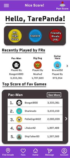
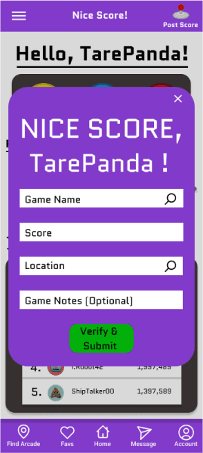

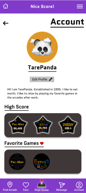
Revisions to High Fidelity Mockup
Revisions to High Fidelity Mockup
Revisions to High Fidelity Mockup
After conducting a comprehensive usability study, it became evident that the presentation of content was overly congested. To address this issue, I implemented a thoughtful redesign that allowed each section to have ample breathing space. The invaluable feedback from participants in the study highlighted the need for relocating the home button to the lower navigation bar, resulting in a more intuitive user experience. Additionally, recognizing the importance of easy access to the post score button regardless of the user's location within the application, I strategically relocated the button to the top right corner. It became evident that the inclusion of two submit buttons was unnecessary. Users expressed a clear preference for a single, streamlined button that served both the purpose of verification and submission of their scores. Understanding the importance of simplicity and user-friendly interactions, I promptly removed the redundant button, ensuring a more seamless and efficient experience for users as they verify and submit their scores. These enhancements not only improve the overall usability but also enhance user engagement and satisfaction.
After conducting a comprehensive usability study, it became evident that the presentation of content was overly congested. To address this issue, I implemented a thoughtful redesign that allowed each section to have ample breathing space. The invaluable feedback from participants in the study highlighted the need for relocating the home button to the lower navigation bar, resulting in a more intuitive user experience. Additionally, recognizing the importance of easy access to the post score button regardless of the user's location within the application, I strategically relocated the button to the top right corner. It became evident that the inclusion of two submit buttons was unnecessary. Users expressed a clear preference for a single, streamlined button that served both the purpose of verification and submission of their scores. Understanding the importance of simplicity and user-friendly interactions, I promptly removed the redundant button, ensuring a more seamless and efficient experience for users as they verify and submit their scores. These enhancements not only improve the overall usability but also enhance user engagement and satisfaction.
After conducting a comprehensive usability study, it became evident that the presentation of content was overly congested. To address this issue, I implemented a thoughtful redesign that allowed each section to have ample breathing space. The invaluable feedback from participants in the study highlighted the need for relocating the home button to the lower navigation bar, resulting in a more intuitive user experience. Additionally, recognizing the importance of easy access to the post score button regardless of the user's location within the application, I strategically relocated the button to the top right corner. It became evident that the inclusion of two submit buttons was unnecessary. Users expressed a clear preference for a single, streamlined button that served both the purpose of verification and submission of their scores. Understanding the importance of simplicity and user-friendly interactions, I promptly removed the redundant button, ensuring a more seamless and efficient experience for users as they verify and submit their scores. These enhancements not only improve the overall usability but also enhance user engagement and satisfaction.
Accessibility Considerations
Accessibility Considerations
Accessibility Considerations
While users can use the swiping gesture to scroll. Buttons have been placed on each swiping gesture elements to allow user to use buttons instead of using the swiping gesture. This allow users an option to disable the motion from the swiping gesture.
Contrast and color combination were heavily consider when designing the look of the application.
Hierarchy, scale, and repetition help with overall navigation though the application.
Going Forward
Takeaways
Impact:
Buttons allows users an option to disable the motion from the swiping gesture.
What I Learned:
There is a large community who chase high score for arcade games and to be able to cater t o that community and centralize it would be beneficial to the community. Even though submitting high scores is the main focus of the application, being able to interact and celebrate with the community means so much more
Next Steps
The next step is to make a dark mode vision to make the application more accessible for those who have light sensitivity.
Add features where arcade owners can interact with arcade goers and put on competitions for create a more well-rounded community. Arcade user would be able to input information such as a game location map of arcade and a list of games they have available.
Implementing where arcade goers can compare different arcades to see what games the arcade provides if they are seeking to beat a particular game high score.
Low Fidelity Prototype
The primary user flow focuses on posting a score and sharing it with the frenemies list. To ensure a seamless experience, I ensured that both the top and bottom navigation bars contained clickable elements. Additional frames were created to enhance the overall user flow and provide a more comprehensive experience.
Refining the Design
Mockups
Following the redesign of the second iteration of the low-fidelity wireframe for Nice Score!, I proceeded to create a mockup that emphasized the application's brand identity. My goal was to infuse the design with the essence of the Nice Score! brand. During my competitive analysis, I observed that many product designs in the market appeared either outdated or overly corporate. In contrast, I aimed to imbue Nice Score! with a playful, retro-inspired, and visually captivating design. This concept captures the visual essence of an arcade experience!
Round 2 Findings
Another round of usability testing was conducted to evaluate the main user flow in relation to the mockup design. Key performance indicators such as time on task, user error rate, and system usability scale were utilized to gather valuable insights. The following findings were obtained from this second round of usability testing:
The sizing and spacing elements were identified as being too small and crowded, affecting user experience.
It was observed that the home button should be included in the button navigation bar for better accessibility.
Additionally, it was determined that having two submit buttons is unnecessary.
These insights highlight areas for improvement in the design to enhance user satisfaction and overall usability.
Going Forward
Takeaways
Impact:
Buttons allows users an option to disable the motion from the swiping gesture.
What I Learned:
There is a large community who chase high score for arcade games and to be able to cater t o that community and centralize it would be beneficial to the community. Even though submitting high scores is the main focus of the application, being able to interact and celebrate with the community means so much more
Next Steps
The next step is to make a dark mode vision to make the application more accessible for those who have light sensitivity.
Add features where arcade owners can interact with arcade goers and put on competitions for create a more well-rounded community. Arcade user would be able to input information such as a game location map of arcade and a list of games they have available.
Implementing where arcade goers can compare different arcades to see what games the arcade provides if they are seeking to beat a particular game high score.
Lets Connect!
Got any questions, concerns or suggestions?
Please contact me at ly.sandy.c@gmail.com
Chelsea
42 Years Old
Problem Statement
Chelsea, a dedicated working mother and wife who frequently travels, yearns to share her high scores with her family even while being away, as it serves as a means of maintaining a strong connection with her loved ones.
“Sunday afternoons at the arcade with my family are my saving grace from the chaotic work week. I love sharing my childhood experience with my son”
Goals
Wants to bond with her family when she is away for work.
Would like to share high scores found around the country with her son.
Would like to easily locate arcades that have similar games to her home arcade.
Frustrations
"It makes me sad when I am away on travel and I can't truly bond with my family over our shared love for arcade games.
“I wish there was a way to find arcades that have similar games to my home arcade. Currently, I have to look on their website or social media to get an idea of what games they have.”
“It would be awesome to share high scores from the different arcades I visit with my son. It's kind of annoying to send so many pictures to him."
FIND ARCADE
TASK LIST
Google Search “Arcade Nearby”
Pick one close by to hotel
Use google maps
EMOTIONS
Curious
Anxious
Bittersweet
IMPROVEMENT OPPORTUNITIES
Better searching methods for finding arcades in app
List of games each arcade provide prior to arrival
GO TO ARCADE
TASK LIST
Get into the car and use google maps
Pick route fastest to get to arcade
Arrive at destinations
EMOTIONS
Anxious
Focused
Defensive
IMPROVEMENT OPPORTUNITIES
Offer ridesharing on app
STRATEGIZE GAME PLAY
TASK LIST
Walk around to get layout of arcade and find favorite games to play
Set time and budget to play
Play games
EMOTIONS
Calculative
Determined
Excited
IMPROVEMENT OPPORTUNITIES
Map of arcade
Immediate access to see high score for games at the arcade
SHARE HIGH SCORE WITH SON
TASK LIST
Pull out phone to take picture of her score
Message son with picture of her high score
EMOTIONS
Accomplished
Ecstatic
Caring
IMPROVEMENT OPPORTUNITIES
App to submit scores and alerts son of score
Reaction button and chat function
Starting the Design
Paper Wireframes
Throughout each iteration of the paper wireframes, my goal was to address the user's pain points effectively. I ensured that the 'post high score' button stood out prominently. The design also placed emphasis on displaying and sharing high scores for favorited games. Moreover, I aimed to add a personalized touch to the home screen, allowing users to conveniently access their scores and rival lists. Simplicity was key in the design, ensuring that users wouldn't feel overwhelmed when using the application. The circled items on each sketch will be incorporated into the initial digital wireframe.
Digital Wireframes
Presented below are the initial iterations of the digital wireframe. The design boasts user-friendly navigation, with clearly labeled sections for easy exploration. Users can effortlessly post their scores from any point within the application, thanks to the fixed bottom navigation bar.
Usability Study
I conducted a usability study on the initial wireframes to gain insights into user interactions with my application and identify areas for improvement before proceeding with the creation of a mid-fidelity mockups. The research questions I aimed to answer were as follows
How long does it take for a user to post a high score?
Can users successfully post their scores?
Can users successfully share their scores with friendly rivals?
Is it clear in the design how to post a high score?
Which parts of the application's design are unnecessary?
To measure the success of addressing these questions, I utilized key performance indicators such as time on task, conversion rates, drop-off rates, and the system usability scale. This unmoderated usability study involved providing participants with a link to a Google Form containing tasks to complete and a usability scale. During the task section, participants were instructed to record their interactions with the application and share their thoughts out loud.
Round 1 Findings
As a result of the usability study, below are the following insights I gained:
Enhancing the visibility of pagination is crucial.
Users express the desire for a method to authenticate their scores.
It is necessary to reconsider the design of navigation buttons and pages.
Revised Low Fidelity Wireframe
Based on the findings, I revisited the wireframe and incorporated adjustments to address the feedback received. Presented below is the second iteration of Nice Score! Here's a summary of the changes made:
Pagination: The pagination feature has been redesigned to offer a gesture-based experience, accompanied by a visual indicator that informs users about horizontal scrolling for accessing additional content.
Verification Button: To cater to user preferences, I introduced a verification button within the high score submission overlay. This feature enables users to utilize their device cameras to scan and authenticate their high scores while at the arcade.
Location Locator: After considering participant feedback, I decided to remove the location locator feature from the top right. This decision was made as it caused confusion among users, served as a redundant feature, and wasn't essential for the initial release of the application. In its place, I incorporated a hamburger menu that grants users access to their high scores, explore section, and friendly rivals when not on the home page.
Home Button: Addressing a missing element in the initial wireframe, I added a home button for improved navigation and ease of returning to the home page.
Low Fidelity Prototype
The primary user flow focuses on posting a score and sharing it with the frenemies list. To ensure a seamless experience, I ensured that both the top and bottom navigation bars contained clickable elements. Additional frames were created to enhance the overall user flow and provide a more comprehensive experience.
Refining the Design
Mockups
Following the redesign of the second iteration of the low-fidelity wireframe for Nice Score!, I proceeded to create a mockup that emphasized the application's brand identity. My goal was to infuse the design with the essence of the Nice Score! brand. During my competitive analysis, I observed that many product designs in the market appeared either outdated or overly corporate. In contrast, I aimed to imbue Nice Score! with a playful, retro-inspired, and visually captivating design. This concept captures the visual essence of an arcade experience!
Going Forward
Takeaways
Impact:
Buttons allows users an option to disable the motion from the swiping gesture.
What I Learned:
There is a large community who chase high score for arcade games and to be able to cater t o that community and centralize it would be beneficial to the community. Even though submitting high scores is the main focus of the application, being able to interact and celebrate with the community means so much more
Next Steps
The next step is to make a dark mode vision to make the application more accessible for those who have light sensitivity.
Add features where arcade owners can interact with arcade goers and put on competitions for create a more well-rounded community. Arcade user would be able to input information such as a game location map of arcade and a list of games they have available.
Implementing where arcade goers can compare different arcades to see what games the arcade provides if they are seeking to beat a particular game high score.
Lets Connect!
Got any questions, concerns or suggestions?
Please contact me at ly.sandy.c@gmail.com


